I’m teaching my first class as instructor of record this summer. I’ve TA’d and graded for a number of classes, and tutored, and given talks at conferences and so on, but this is the first class that’s been completely mine! The final exam is this week, and one thing I’ve worried about is grade inflation.
When I was in elementary school and we first began receiving letter grades, I was taught that F’s were fails, D’s were below average, C’s were average, B’s were above average, and A’s were above and beyond stellar work. As a stats nerd, this should mean one standard deviation of the mean is C, two standard deviations are D’s and B’s, and three standard deviations are A’s and F’s.
This… isn’t the case. At all. In fact, in a lot of colleges, B’s are average, A’s are above average, and C’s are below average. D’s and F’s are reserved for people who didn’t even try. Grades aren’t in yet for my class (they still have one more homework assignment and the final exam to pull their grades up or down), but it seems the average in my class will be around an 84%. Probably no one will fail the class, but two or three students are bordering in the D range (mostly because they didn’t complete all the assigned work). The remainder of the class seems to have divided itself evenly among A’s, B’s, and C’s. This puts the class average GPA somewhere between a 2.9 and a 3.0.
But is that too high? After all, I gave them extra credit opportunities. Maybe I was being too easy on them? Should C really be average? Is grade inflation even a real thing? Will they hate me and complain if I don’t give them A’s? Will I crush their hopes and dreams if I give them C’s? Some people think grade inflation is a serious problem, and I tend to agree.
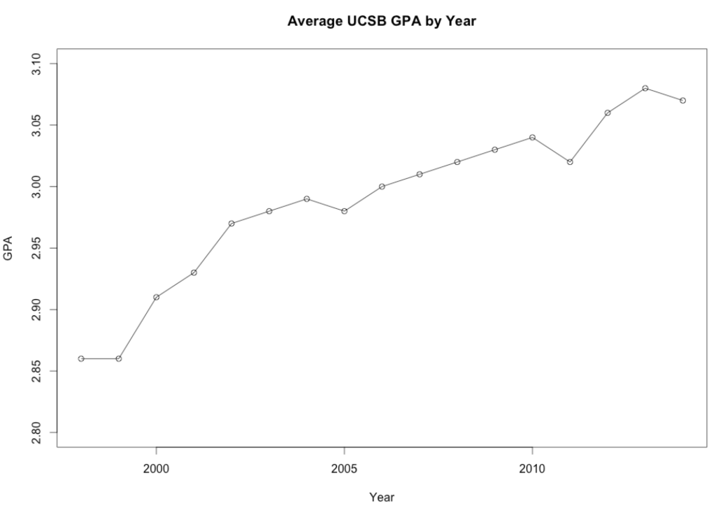
So I dug around for data. And I found out that my institution actually has data for average GPA going back all the way to 1998! I grabbed the average GPA for undergrads from each year, popped them into R, and produced this graph:
Apparently, yes, grade inflation is a thing. Yes, these undergrads really are getting better grades than I got when I was their age. It’s hard to know what drives grade inflation (are professors afraid of bad evals? or are students genuinely doing better?), but according to this graph it’s definitely a thing.
Graphs can be deceptive, so the next question I asked was: is it statistically significant? A quick correlation test shows this data has a Pearson’s R of 0.95, p = 0.000000004.605. For those who have never taken a statistics course, that’s a VERY SMALL p value, which means it’s probably not by chance that these data are distributed this way. It’s also a VERY LARGE Pearson’s R value, which means you can pretty reliably predict the GPA based on the year. By “VERY SMALL” and “VERY LARGE”, I mean that in all my data crunching as a grad student I have never seen a Pearson’s R value that high outside of a contrived example from an Intro to Statistics textbook. So yes, this is statistically significant.
Conclusion? It seems that a B average is pretty standard, and has been for nearly 20 years. In the mid 1990’s, it was closer to a B-, and it looks like by the 2020’s it’ll be closer to B+. Overall, it seems my class average of a B has worked out to be normal for my university in 2014. As it turns out, I wasn’t being too easy or too hard on them. And that makes me happy. :)


Pingback: Lessons learned |