
As part of the Developing Data Products class at Coursera, we’ve been encouraged to share our R Shiny apps on twitter using the #myDataProduct hashtag! I tweeted mine and blogged about it already. I’ve also blogged about word clouds in R. And lo and behold, someone did both! @dscorzoni combined Shiny and word clouds into a nifty little app that takes a URL and generates a word cloud from it! How cool!!
Of all the books I read in high school to prepare for college, How to Lie with Statistics by Darrel Huff was, by far, the best. It’s actually not encouraging lying with statistics. Rather, it encourages you to think when you see a statistic, and question whether the data are presented in such a way that it leads the reader to a false conclusion. It teaches the kind of critical thinking and questioning authority that’s essential for success in academic research, and it’s written at a level that most high schoolers could understand.
Let me demonstrate with two small datasets: More »
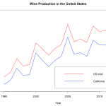
Did you know that over 90% of the wine produced in the United States is made right here in California? I just learned that.
Sometimes, you randomly are in the depths of the internet and you find some data in a hideous table and you just *have* to visualize it! Here’s a brief how-to with some fun data on wine!!
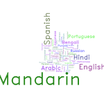
My friend recently asked me how I make word clouds for presentations. Wordle is definitely a good choice. WordPress automatically makes word clouds out of my tags in the sidebar. But sometimes you can’t or don’t want to upload your data to places like WordPress or Wordle and you just want to use R (because you use R for everything else, so why not? Or is that just me?).
In a typical word cloud, word frequency is what determines the size of the word. As of this writing, the word cloud in my side bar (over there →) has “linguistics” and “programming” as clearly the largest words. Tags like “video games,” “language,” and “education” are also pretty big. There are also really small words like “Navajo” and “handwriting.” This reflects the frequency of each tag. Bigger tags are more frequent, so I write about linguistics a lot but not so much about Navajo in particular.
I’m not gonna lie, I’m somewhat jealous of #thegiftofdata. This couple tracked their text messages for a whole year of dating and a whole year of marriage, and got some pretty cool word clouds out of it!
The news coverage of the ebola outbreak is interesting, and probably worth some linguistic analysis at some later point. My impression is that it oscillates between causing and placating panic. One story will decry sanitary conditions in hospitals and demand the borders be closed to West African countries, so everyone panic because we’re all about to die horrible deaths. The next story will emphasize that it’s hard to contract ebola unless you’re handling bodily fluids or eating African fruit bats, so don’t worry everything is going to be okay.
More »
Language has a pretty interesting property known as Zipf’s Law. That is, language data (and even subsets of language data) have a Zipfian distribution. There are a small number of highly frequent words, and a large number of highly infrequent words. Moreover, the frequent words tend to be short, grammatical (words that are grammatically required but don’t really mean anything) and the infrequent words tend to be longer, lexical (words like nouns and verbs which have some sort of referent or meaning).
What does this mean? Well, to show you I downloaded all of the English wikipedia (and you can too here). More »