
My friend recently asked me how I make word clouds for presentations. Wordle is definitely a good choice. WordPress automatically makes word clouds out of my tags in the sidebar. But sometimes you can’t or don’t want to upload your data to places like WordPress or Wordle and you just want to use R (because you use R for everything else, so why not? Or is that just me?).
In a typical word cloud, word frequency is what determines the size of the word. As of this writing, the word cloud in my side bar (over there →) has “linguistics” and “programming” as clearly the largest words. Tags like “video games,” “language,” and “education” are also pretty big. There are also really small words like “Navajo” and “handwriting.” This reflects the frequency of each tag. Bigger tags are more frequent, so I write about linguistics a lot but not so much about Navajo in particular.
The profile and header pictures for my twitter bot @AllTheLanguages are both word clouds created in R using data from this wikipedia page. (As a side note, the bot was down for a month but I just rebooted it… again). Instead of using word frequency to determine word size, I used number of speakers (in the millions).
wordcloud(data$LANG, data$SPK, scale=c(5,.25),
min.freq=2, max.words=Inf, random.order=T, rot.per=.25,
colors=c("blue2", "green4", "purple2", "blue4", "green2", "purple", "darkmagenta", "cadetblue", "darkolivegreen", "blue", "darkcyan"),
random.color=T, vfont=c("sans serif","bold"))
The dataset I used and the full code (including loading relevant packages) are downloadable here, if you’d like to play with it at home. Anyway, this line of code is the main workhorse for creating word clouds in R. I hand-picked a bunch of colors and the font that I wanted, but you could use R palettes or other colors or fonts too. You can play with the scale and stuff. I like random.order and random.color to be true, so each word cloud is unique. Crucially, though, I didn’t do anything to the data other than load it. This makes Mandarin really, really big. It also makes English, Spanish, Arabic, and Hindi pretty big too, but everything else is so tiny as to be basically unreadable. It looks like this:
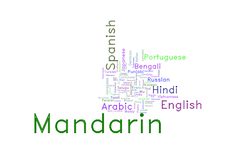
The reason it’s so skewed is because the number of speakers follows a Zipfian distribution. Lots of things follow this distribution, like population of cities or word frequency in corpora. Since we’d like a more even distribution of sizes while still portraying Mandarin et al as larger than the rest, we can take the log2() of data$SPK:
wordcloud(data$LANG, data$SPK, scale=c(5,.25),
min.freq=2, max.words=Inf, random.order=T, rot.per=.25,
colors=c("blue2", "green4", "purple2", "blue4", "green2", "purple", "darkmagenta", "cadetblue", "darkolivegreen", "blue", "darkcyan"),
random.color=T, vfont=c("sans serif","bold"))
This makes a much nicer looking word cloud:
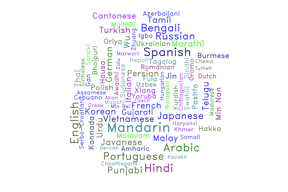
There is still a distinct sense that Mandarin, Spanish, English, and Arabic are dominating, but we’re also giving other top contenders like Portuguese and Japanese a place in the “readably large” font size. Even relatively obscure languages like Chewa and Sylheti are still readable in this word cloud, which celebrates linguistic diversity. Since graphic design and diversity are the main goals of our data visualization here, it’s quite appropriate to take the logarithm of the data. Were scientific accuracy the goal, we’d have to stick with the first word cloud.
You must be logged in to leave a reply.