
The news coverage of the ebola outbreak is interesting, and probably worth some linguistic analysis at some later point. My impression is that it oscillates between causing and placating panic. One story will decry sanitary conditions in hospitals and demand the borders be closed to West African countries, so everyone panic because we’re all about to die horrible deaths. The next story will emphasize that it’s hard to contract ebola unless you’re handling bodily fluids or eating African fruit bats, so don’t worry everything is going to be okay.
What I’m not seeing nearly enough of is infographics. People need data to make decisions and understand the world around them, but raw numbers are hard to process. Infographics can make data more accessible, especially well-designed ones. I’ve always thought if I were to quit linguistics entirely, I’d want to make infographics for a living. So I made a not-so-well designed one with some of the most striking facts I found out by reading the Ebola Wikipedia page.
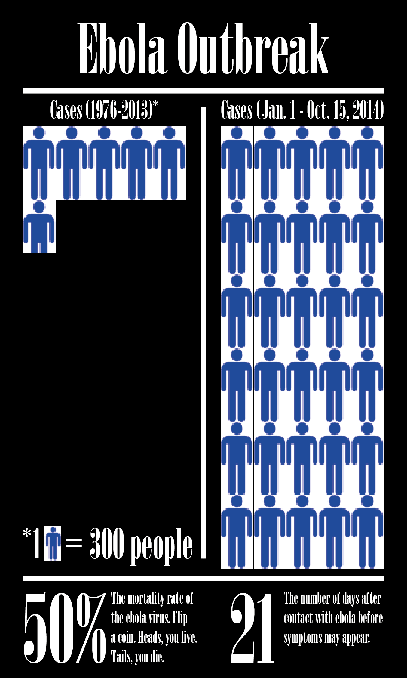
I sort of wondered why I had never really heard of this horrible disease with such a long incubation period and such a high mortality rate. As it turns out, it wasn’t really a “thing” until this year. If you look on the left, that’s all the cases of ebola documented for 37 years. On the right, we have the cases from the last 10 months. And now the World Health Organization is reporting that we could have 10,000 new cases per week. That’s five times as many cases in a week as there were in 37 years.
So, yeah, this year’s outbreak is kind of a big deal.
You must be logged in to leave a reply.