
Of all the books I read in high school to prepare for college, How to Lie with Statistics by Darrel Huff was, by far, the best. It’s actually not encouraging lying with statistics. Rather, it encourages you to think when you see a statistic, and question whether the data are presented in such a way that it leads the reader to a false conclusion. It teaches the kind of critical thinking and questioning authority that’s essential for success in academic research, and it’s written at a level that most high schoolers could understand.
Let me demonstrate with two small datasets:
All the code and data are here. All the data is just stuff you can google fairly easily, but a lot came from here and here, supplemented by wikipedia and this inflation adjustor tool.
Now, to lie with statistics! First off, this lovely bar graph:
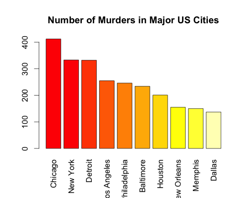
Over 300 murders in Chicago, New York, and Detroit, but less than 200 in New Orleans, Memphis, and Dallas! Based on this chart, you would think that Chicago, New York, and Detroit are the most dangerous cities in the United States. while New Orleans, Memphis, and Dallas are relatively safe. However, the population sizes of these cities are wildly different! So, let’s redo the graph, but by number of murders per 100,000 citizens:
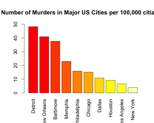
Looking at the per capita data, New York drops from the second-most-dangerous to the safest city. Meanwhile, New Orleans just moved from third-safest to second-most-dangerous. The per capita data accurately reflects your odds of getting murdered. Out of 100,000 people in Detroit, about 50 get murdered every year. That means the odds are 0.05%. You can’t calculate those kind of odds from just the raw numbers.
Alright, let’s look at a more benign example, tuition at the University of California over the last 20 years:
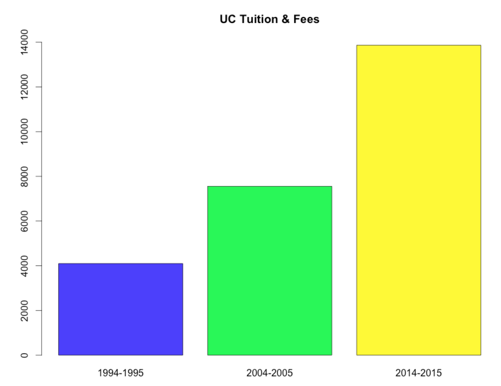
Wow, that looks bad. It appears that tuition has more-than-tripled in the last 20 years, from just over $4,000 a year to well over $13000! This is insanity! But, wait… there’s a little thing called “inflation.” Surely, once it’s adjusted for inflation, things aren’t so bad, right? Let’s see:
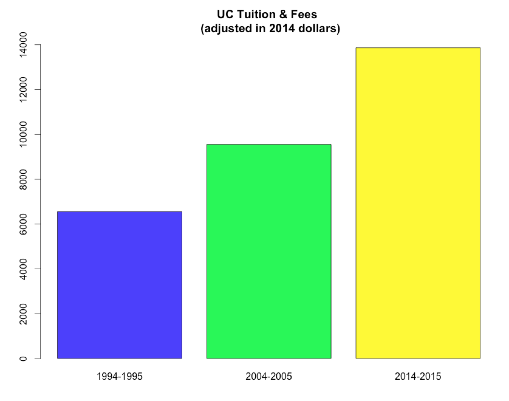 Nope, still bad, although not as bad. If tuition kept pace with inflation, these three bars would be all be the same size. As it stands, it looks like tuition has doubled in the last 20 years. This is better than tripling.
So the moral of the story is: question everything! Are there significance values or error rates listed with percentages? Every time you see an “average,” do they say whether it’s a mean or a median? When tuition or number of murders “triples in size,” did they take into account things like inflation or population size?
You must be logged in to leave a reply.