
Did you know that over 90% of the wine produced in the United States is made right here in California? I just learned that.
Sometimes, you randomly are in the depths of the internet and you find some data in a hideous table and you just *have* to visualize it! Here’s a brief how-to with some fun data on wine!!
Step 1: find some data
I was googling something else, but ended up on this website with the statement that California accounts for roughly 90% of the wine production in the United States. Yep, that’s some data! You might have to actually conduct a study or ask permission to use other people’s data, but this data is just out there, which is nice.
Step 2: obtain the data
The wine data is just a plain old table. I copied it from the website and pasted it into a spreadsheet, then saved the spreadsheet on my desktop as wine.csv. I save it as a .csv since those are easier to deal with in R than other file formats. Some websites have their data available as a downloadable .csv, which would save us a few steps. But this dataset is small, so it’s no big deal.
Step 3: load the data into R
I’m assuming you have R and R Studio installed. If you don’t and you need help, there are lots of R forums out there or you can always email me or comment. (Comments aren’t too reliable since I tend to ignore them due to a very high volume of spam). Open up R Studio and type:
setwd("~/Desktop/")
wine <- read.csv("wine.csv",header=T)
summary(wine)
The first line sets the working directory to the Desktop, so this assumes you did like I did and saved the file on your desktop. The second line saves the file into an object called “wine” and tells R that the first row (the header) are column labels. The third line lets you look at a summary of the data to check that it loaded correctly.
Step 4: clean up the data
The column headers are funky from when I copy/pasted them. Also, it’s a little clunky to deal with such large numbers.
wine$CA <- wine$California./1000000
wine$US <- wine$U.S../1000000
These two lines make new columns in the “wine” data frame. The new columns have much simpler names (CA and US). And they have much simpler data (the old data divided by a million).
Step 5: plot the data
My first go at plotting the data won’t be pretty. We’ll clean things up later.
plot(wine$CA~wine$Year,type="l")
lines(wine$US~wine$Year,type="l")
This creates a plot that looks like this:
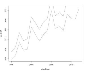
There are a lot of things wrong with this plot. First off, the y-axis isn’t tall enough to accommodate all the data. Second, the axis labels are not transparent at all. Third, there’s no title! And last, there are no pretty appealing colors or legends! But, this step is still important since it lets you check to make sure your data graph the way you expect them to.
Step 6: make the plot pretty
These lines of code fix all the problems in the above paragraph:
plot (wine$Year,wine$US,col="red",lwd=2, type="l", ylim=c(375,775), xlab="Year",ylab="millions of gallons",main="Wine Production in the United States")
lines(wine$Year,wine$CA,col="blue",lwd=2)
legend(2003,490, c("US total","California"), lty=c(1,1), lwd=c(2,2),col=c("blue","red"))
And it makes a pretty graph like this:
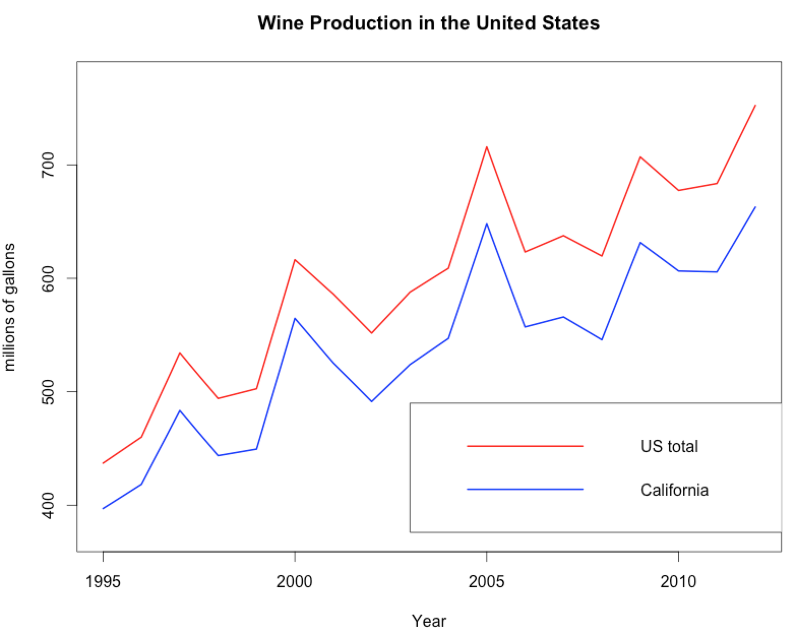
Yay data visualization!!
You must be logged in to leave a reply.