
T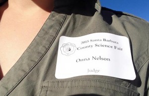 oday I volunteered as a judge for the Junior Division of Social, Behavioral, and Cognitive Sciences at the local County Science Fair!!
Even though I had to get up an hour and a half earlier than I normally do, it was totally worth it! I learned that if you feed ants aspartame, they don’t build tunnels that are as deep as ants that are fed sugar. I learned that praising preteens based on their effort (“You worked hard!”) is better for their confidence and willingness to try a harder puzzle than if you praise their innate ability (“You’re smart!”) or remain neutral (“You completed the puzzle!”). I also learned that people pay much more attention to the number of stars an online review has than just about any other information, and that special needs children work better when listening to rap music than when listening to classical or no music.
I’ll definitely do this again next year!
 Science fairs and academic conferences have a lot in common. In fact, the “poster session” at any academic conference is essentially a grown-up science fair. After today, and after reflecting on some of the conferences I’ve been to, and some of the poster presentations I’ve made or helped my students make, I’ve come up with two key pieces of advice:
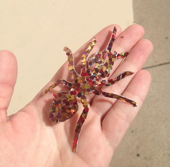
(1) Give your audience something to take home. If you’re a kid at the science fair, this can be something cool, like this awesome giant construction-paper-and-glitter ant. If you’re an academic at a conference, this should be a handout summarizing your results and/or a business card with a way to contact you. This will help people remember your project and think more favorably of you!
(2) Make your font size bigger. No, that’s not big enough. Bigger. Seriously. I gave this advice to probably half of the science fair projects I worked on today, and when I think about the conference posters I’ve made or helped make, people always tend to under-estimate font sizes. You should be able to read it from 5-10 feet away. Correction: a 40-year-old with bifocals should be able to read it from 5-10 feet away. This might mean you the young science fair hopeful or graduate student, should be able to read it from 15-20 feet away. Same for your graphs, and all the tiny little labels on your axes. Enormous fonts (24-36pt) are perfect for text. Moderately large fonts (18pt) are good for less important things like axis labels or citations. And while you’re at it, 1.5 space everything and be generous with your margins and white space! It’s just good design.
You must be logged in to leave a reply.